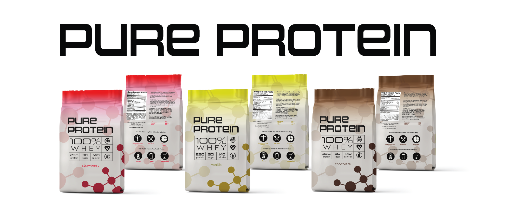
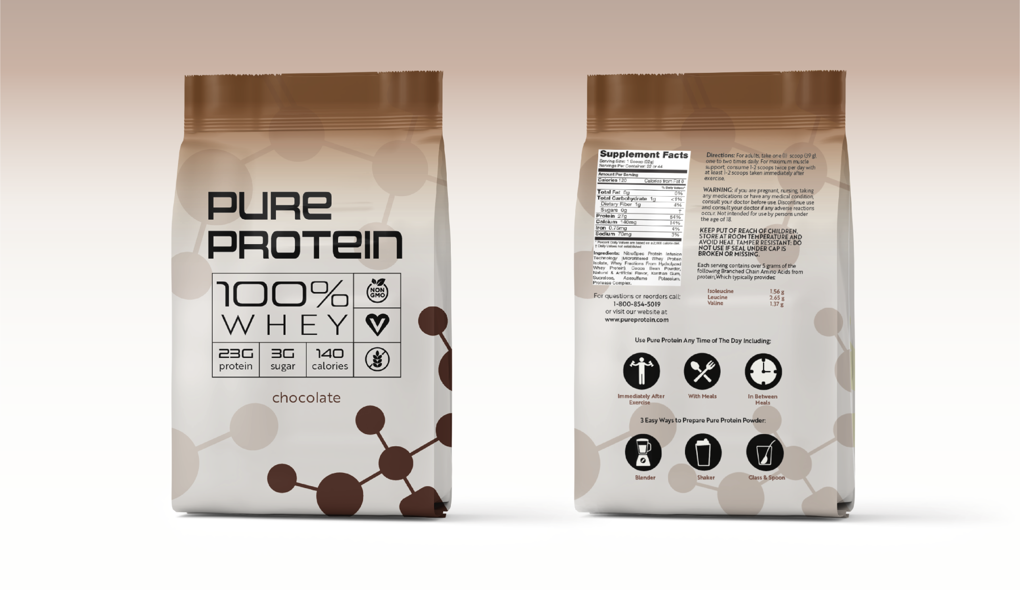
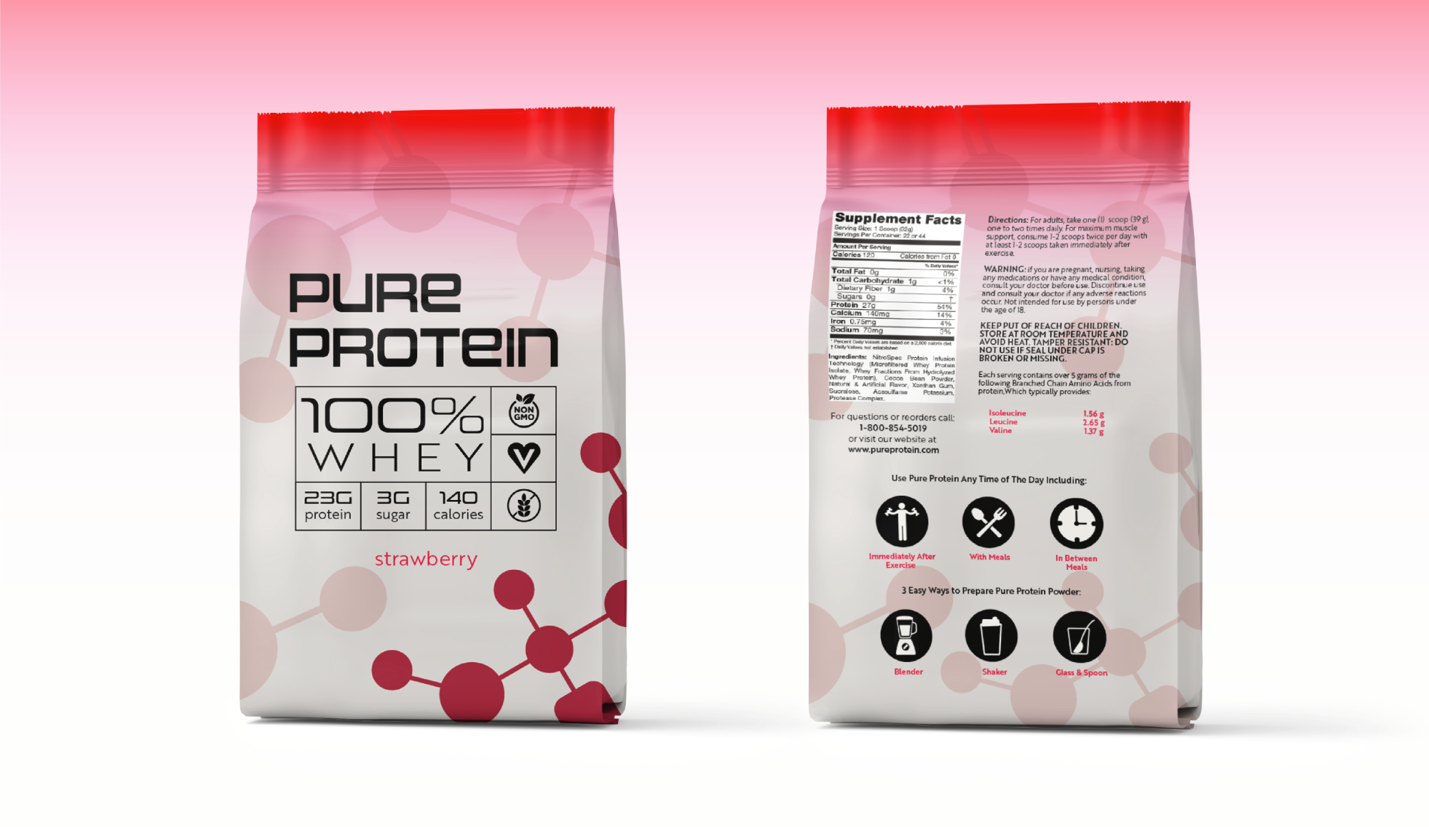
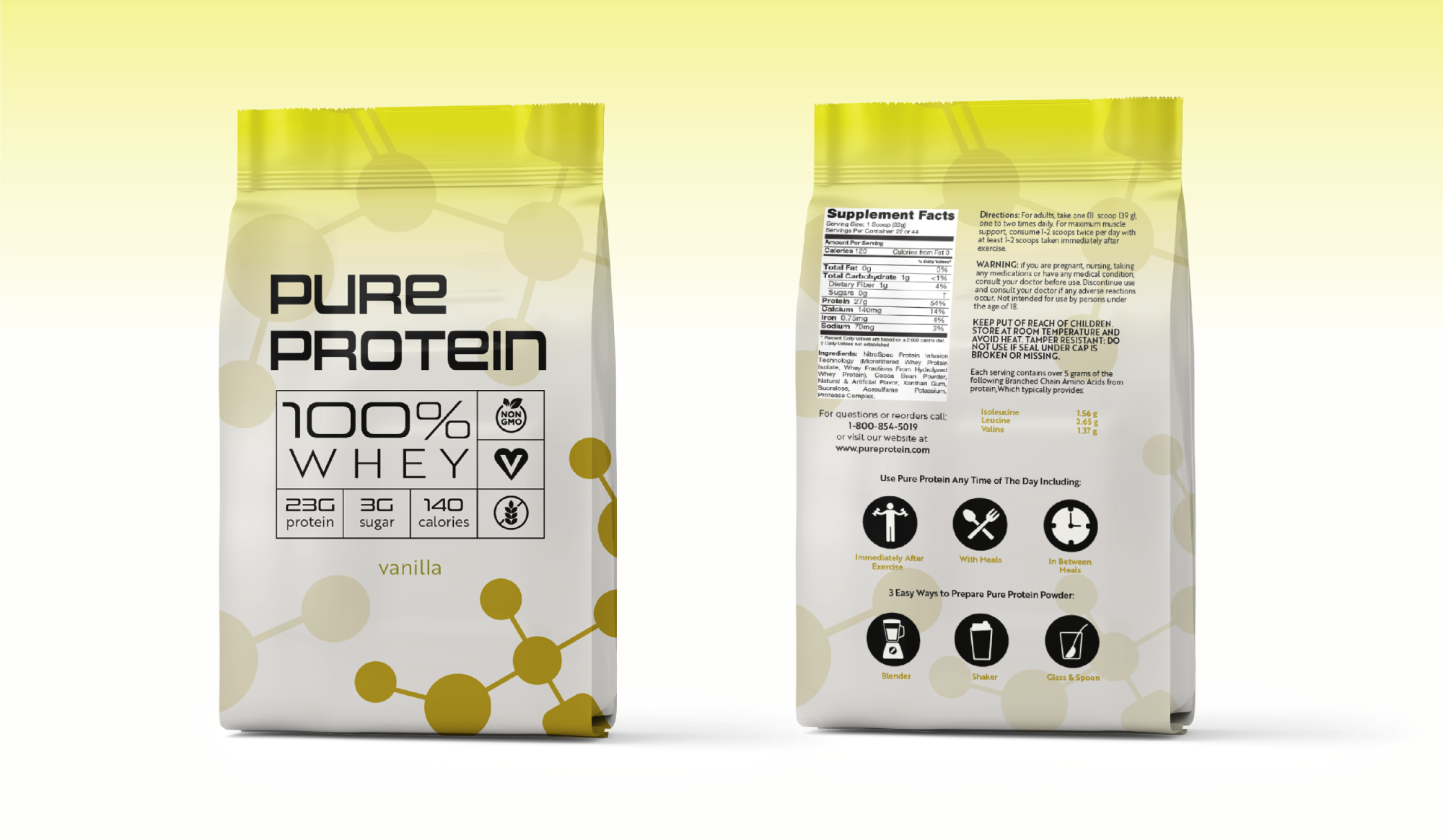
Pure Protein Conceptual Rebrand
Pure Protein is a conceptual rebrand that reimagines the identity of a familiar supplement through a clean, minimal, and science-forward lens. The visual system is anchored by a custom geometric wordmark and a dynamic background pattern inspired by protein molecular structures—designed to subtly allude to the science behind nutrition and muscle support.
Each flavor variant uses a unique color palette and molecule-inspired forms to reinforce both flavor differentiation and scientific credibility. On the front, clean iconography and a grid-based layout present the product’s key benefits—protein count, calorie info, and dietary tags—at a glance. The back panel is optimized for user clarity, complete with usage suggestions and mixing instructions. This rebrand elevates Pure Protein from a standard supplement to a sleek, modern essential for health-conscious, design-savvy consumers.
Project: Pure Protein Conceptual Rebrand
Role: Branding, Packaging Design, Visual Identity
Objective: Refresh and modernize the packaging of Pure Protein powder to appeal to a more design-conscious, health-focused consumer while maintaining clarity, trust, and shelf impact.
Design Goals:
- Create a clean, futuristic visual system rooted in wellness and performance
- Emphasize product benefits through clear icons and legible data
- Use color-coded flavors to aid customer navigation and visual appeal
- Introduce a bold typographic identity to convey energy and modernity
Target Audience:
Active individuals aged 18–40 who prioritize wellness, nutrition, and aesthetics. They value clean design, transparency in labeling, and products that align with their lifestyle—whether that’s gym-focused, plant-based, or simply health-aware.
Design Solution:
The rebrand features a geometric wordmark paired with a molecular-inspired visual motif, referencing protein structures to evoke scientific credibility and purity. A minimal, grid-based layout emphasizes legibility and ease of use, while distinct color palettes and icon systems help differentiate flavors and key nutritional benefits.
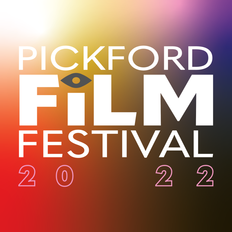
Pickford Film Festival
A conceptual rebrand for Pickford Film Festival, capturing indie film energy through bold typography, vivid color, and retro-modern design.
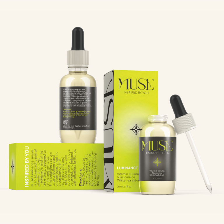
MUSE
MUSE is a conceptual high-end skincare brand created to elevate daily routines into moments of mindful beauty. With a minimal yet indulgent aesthetic.
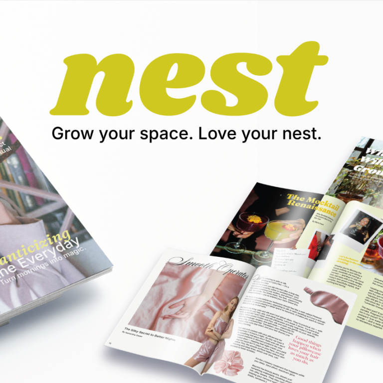
Nest Magazine
Nest is a design-forward magazine celebrating the art of staying in. Featuring original layouts, bold typography, and cozy-chic content, it brings modern home living to life.
© Copyright. All rights reserved.
We need your consent to load the translations
We use a third-party service to translate the website content that may collect data about your activity. Please review the details in the privacy policy and accept the service to view the translations.